A cursor glides across a beautiful dashboard. Numbers animate. A logo arrives with confidence. The viewer still does not know what the app is for.
Start the demo one step earlier, with the small annoyance that makes the product necessary.
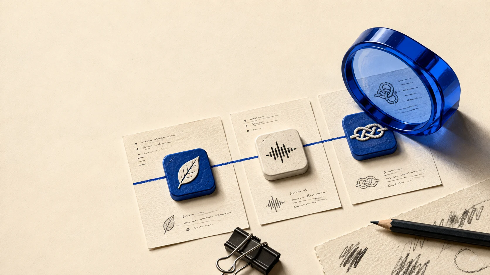
A three-scene storyboard
Before: Show the context. In a hypothetical research workflow, a builder has several app tabs open and cannot remember which source supports which claim.
Action: Demonstrate one real task: save the app, inspect a dated observation and add it to a shortlist. Use the actual product behavior, including any condition the viewer needs to understand.
After: Show the useful artifact: a shortlist with sources, not a vague promise of entrepreneurial success.
This structure works because the result can be compared with the starting problem. A montage of unrelated features cannot make that comparison as easily.
Keep the evidence legible
Use a crop large enough to read on a phone. Slow down at the decision point. Avoid surrounding a tiny interface with so much decorative motion that the product becomes wallpaper.
If you accelerate a wait or omit setup, make the edit understandable. Do not imply that a manually prepared result is automatically generated in ordinary use.
Finish with the next job
The call to action should continue the demonstrated workflow. “Research an app” is a more coherent destination than a generic signup request if that is what the viewer just watched.
Measure whether people who watch the demo complete that action after arriving. A high completion rate on the video itself may simply mean it was short or entertaining.
Before exporting, ask someone unfamiliar with the product to explain what changed between the first and last scene. If they can only describe the colors, the storyboard needs a clearer job.
The magic bit earns its place when the annoying bit is recognizable and the result is real.